
Using analytics as part of your Facebook marketing strategy is considered a best practice, yet adding analytics to your website requires deep technical knowledge and access to the website code-base.
This project covers how my team and I designed and built an entirely new way for Facebook business users to set up web analytics – without having to write a line of code.
 Setting up analytics should be as easy as inputting your website URL
The two most common reasons for a business user to use Facebook’s web analytics tools is to:
Traditionally the only way to set up this type of analytics, is to put a snippet of code on your website, or integrate via any of Facebook’s partner platforms (Shopify, Wordpress etc). But if you are in marketing and don’t have access to the website code, or aren’t on any of the partner platforms, you won’t easily be able to do the things above.
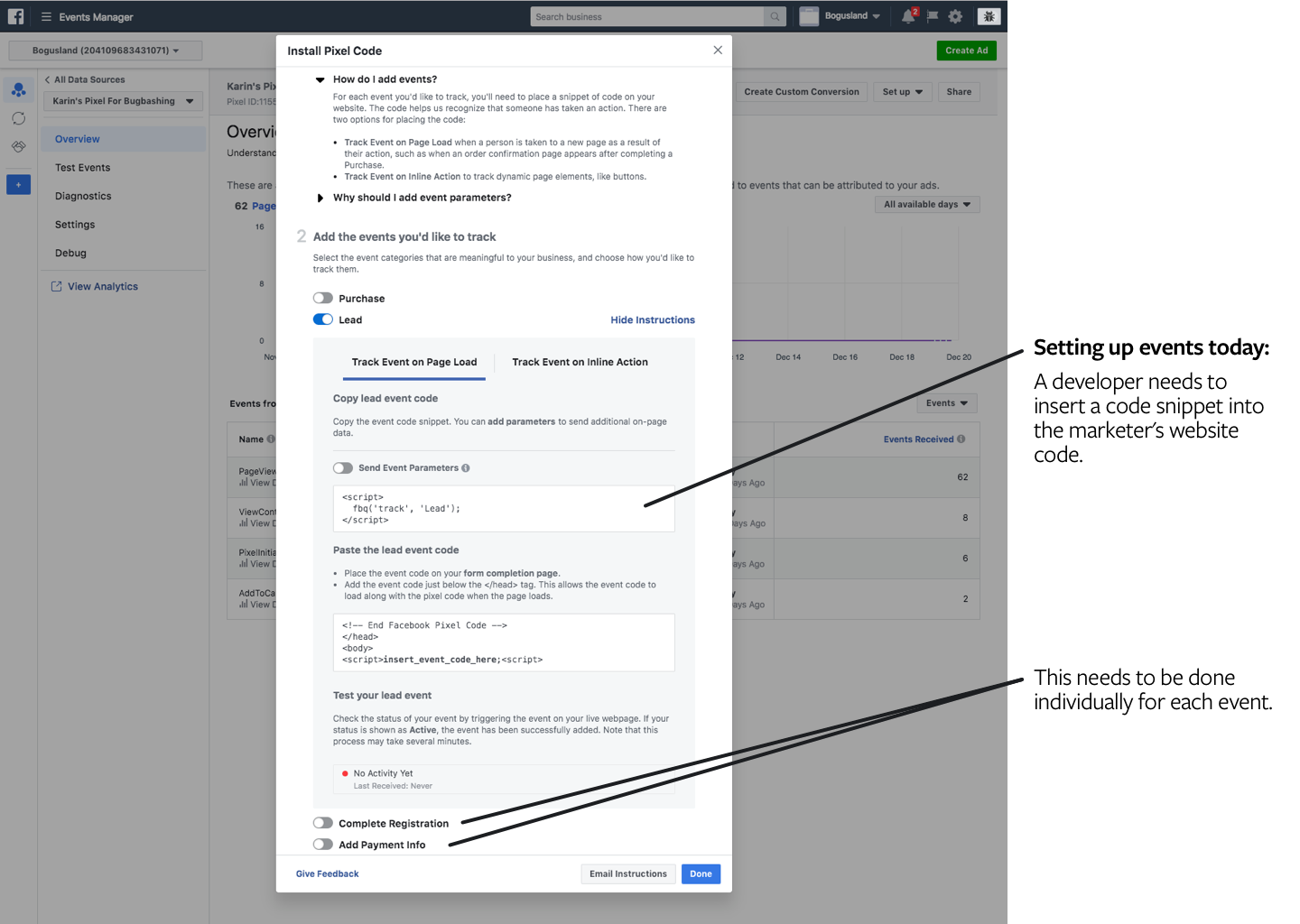 The current "setup flow" is really just a slightly interactive dev doc
Designers at Facebook generally work as “full-stack” product designers, meaning we are responsible for everything from gathering requirements and understanding users and use cases, to building prototypes and defining the final visual- and interaction design specs.
I was the lead designer on this project, working together with a content strategist, a user researcher and a team of cross functional peers including PM, engineering and data science.
Design and ship an experience that allows a marketer with no technical expertise to set up and manage web analytics on their site.
We set some UX-specific ship criteria that included:
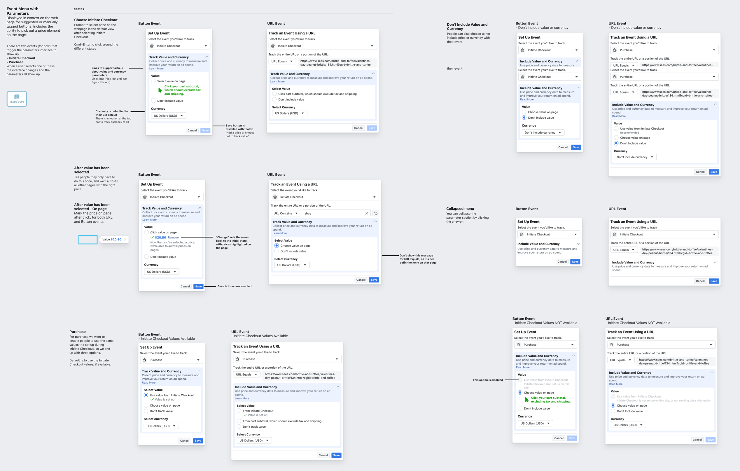
The basic idea of the product is that you can input your website, and then get a Facebook hosted UI overlaid on top that allows you to tag buttons or URLs with “events” that you want to trigger every time a person clicks the button or visits the URL.
This was challenging from a design perspective since you need to be able to differentiate the Facebook-hosted UI from your website, without the website being covered up or distorted by the overlay. After a few different iterations, we solved this with a compact movable module as the main control, and other pieces of UI would show up as needed during different parts of the workflow.
The beta version of the product.Additional complexity was introduced when, in addition to tagging the button with what type of action it represents, we also wanted to provide the ability to add price information in order to support the use case of measuring ROI. We managed to solve this by getting the user to point at the price on the page as part of the setup flow.
Prototype of adding price information. We even did an eye-tracking research study to make sure people were able to follow along with the multiple visual queues given.The design and development for this product was quite fast: we went from nothing to a closed beta in six months, and to a full release in nine.
During that time I:
 Example design spec that lays out all the states for a given component.
By the time we were about to launch the beta, our UX metrics weren’t where we’d expected and I had to convince the team to push back the release by a month. It was a hard but important exercise in keeping the team accountable for hitting the goals we had set around usability. After about a month we were able to make enough changes that we were meeting or exceeding all goals.
In addition to exceeding all of our goals, we also received a highly positive reception through the feedback tool and some industry experts.
As with all projects there are things I’d done differently were I to do it again, or if I’d had more time to iterate before handing the project off.